8 Flower Color Combinations that Designers Should Try
Flower designers frequently use color theory to produce visually appealing arrangements that match their clients' preferences. Selecting the perfect flower color combinations is important, as it influences the overall beauty of floral designs. Balancing color harmony while introducing unique color palettes can turn a simple arrangement into an extraordinary work of art. In this article, we'll look into eight innovative flower color combinations that designers should explore to capture attention with their work.
#1 Classic Color Combos: White and Green
Embrace the timeless sophistication of white and green, where white roses, calla lilies, or peonies meet the lush greenery of ferns or eucalyptus. Showcasing how effective color choices in flower pots can enhance the beauty of any space. This color scheme exudes purity and natural elegance, making it a great choice for various events. From elegant weddings to sophisticated garden parties, often rely on a complementary color scheme for its success. Showcasing the potential of combining color and white flowers, the white blossoms stand out against the lush greenery, creating a peaceful setting that is both refreshing and classically beautiful.


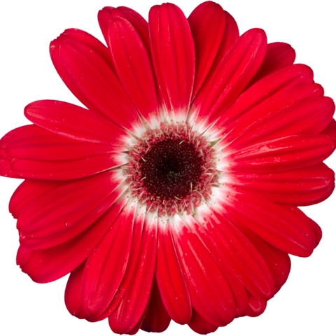
#2 Vibrant Contrast: Bold Reds and Soft Pinks
Explore the vibrancy of combining bold reds with soft pinks, utilizing a color strategy that represents nature’s harmony in your floral designs. Imagine the intensity of red roses or carnations meeting the gentle touch of pink peonies or cherry blossoms. This palette strikes a balance between energy and softness, perfect for creating a statement piece that's both romantic and daring.

#3 Warm Tones: Orange and Yellow Harmony
Pairing orange marigolds or gerberas with yellow flowers such as sunflowers or daisies for a cheerful color scheme. This sunny combination brings an uplifting vibe to any space. It’s ideal for adding a touch of warmth to both outdoor and indoor settings, creating an inviting, energetic atmosphere.


#4 Cool Flower Color: Blues and Purples
Use the calming hues of blue hydrangeas or delphiniums blend with the regal presence of purple irises or lavender to create an alluring color palette. This color scheme offers a soothing retreat that inspires rest.

#5 Earthy Color Theory: Browns and Rusts
Ground your designs in the rich, earthy tones of brown and rust. This palette echoes the organic beauty of nature, perfect for creating a rustic vibe in your floral arrangements. Utilize the deep, warm shades of chocolate cosmos or rust-colored calla lilies. Then complement the textured accents of dried seed pods or branches, and consider incorporating a few cool colors for contrast. 
Rusty Terracotta Roses
#6 Monochromatic Color Scheme
Master the art of monochromatic elegance by selecting a single color, such as a primary color, and exploring its shades, tints, and tones for a sophisticated and cohesive look. A monochromatic arrangement might feature the varied intensities of blue – from the lightest hydrangea to the deepest violet – offering a sophisticated, cohesive look that celebrates the complexity of a single hue.
#7 Unexpected Complementary Color Combinations
Use complimentary colors to create surprising combos that generate excitement. Combine the fiery warmth of orange tulips with the cool tranquility of blue forget-me-nots for a high-contrast look that’s visually striking. This approach brings a lively, dynamic energy to your designs, perfect for making a bold statement with your color choices in gardening or interior design.

#8 Soft and Subtle Flower Garden: Pastel Mixes
Craft a gentle, dreamy atmosphere with pastels, mixing hues like soft lavender, pale pink, and baby blue, adding purple flowers to introduce a secondary color that enriches the palette. This delicate palette can include flowers like pastel ranunculus, soft-colored lilacs, and light-hued roses.

Maximizing the Color Wheel in Cut Flower Arrangements
The color wheel is essential for crafting stunning bouquets, offering a visual guide to blend hues for maximum impact. It helps in achieving color harmony. Designers can create a captivating visual experience by understanding which colors intensify each other for dynamic arrangements or blend seamlessly for a subtle effect.
The Art of Color Combos in Floral Design
Exploring color combinations in floral design opens a realm of creativity. By mixing colors purposefully, you can create arrangements that convey romance, celebration, or solemnity in garden beds. For instance, combining passionate reds with innocent whites can signify love and purity, ideal for weddings, while pairing vibrant oranges with yellows can enhance the energy and joy of a summer event.

Seasonal Garden Color Schemes for Bouquets
Seasonal color palettes play a pivotal role in floral design, guiding the selection of blooms that are not only visually stunning but also contextually appropriate. Spring might inspire bouquets with soft pastels, while autumn calls for richer oranges and browns. Leveraging these palettes ensures the arrangements resonate with the time of year, making them feel more natural and cohesive with seasonal themes.
Creating Mood with Color in Floral Arrangements
Color schemes in floral arrangements set the mood for any occasion. Colors have the power to influence emotions and create the desired ambiance. For example, using cool blues and purples can stimulate calmness and serenity, ideal for serene garden settings, while warm colors like reds and pinks might be used to cultivate a sense of warmth and love.
Crafting Vibrance: Mastering the Garden Color Scheme for Stunning Floral Displays
Choosing Flower Explosion offers you the advantage of outstanding quality and variety, ensuring that every bloom you select is fresh, vibrant, and perfect for your needs. Our commitment to exceptional customer service and our passion for floral beauty sets us apart, providing you with not just flowers, but an extraordinary experience. Trust in our expertise and dedication to bring your floral concepts to life with elegance and precision. Reach out to us and let Flower Explosion enhance your floral designs with our exquisite selections.
Frequently Asked Questions
Q: What is an analogous color scheme?
A: An analogous color scheme is when colors that are next to each other on the color wheel are used together, creating a harmonious and cohesive look.
Q: How can I use the color wheel to enhance my flower arrangements?
A: The color wheel is vital in floral design, helping you create visually appealing bouquets by understanding color relationships. Use it to find complementary colors (like purple and yellow) for vibrant contrasts, or select analogous colors (colors next to each other on the wheel) for a more harmonious look.
Q: What are some effective color combinations for cut flower arrangements?
Effective color A: combinations can range from high-contrast pairings, like orange and blue, to subtle monochromatic schemes using various shades of one color. Experimenting with tertiary colors or your favorite color combinations can also yield stunning results, adding depth and interest to your bouquets.
Q: Can the color temperature affect the mood of my floral bouquet?
Absolutely! Warm colors (reds, oranges, yellows) can create a feeling of warmth and excitement, while cool colors (blues, greens, purples) are often more calming and soothing. Choosing the right color temperature can set the intended mood for your floral arrangement, from energetic celebrations to peaceful displays.
Q: How can seasonal color schemes be applied to bouquets without focusing on garden themes?
Seasonal color schemes reflect the current time of year, influencing the choice of blooms for arrangements to ensure they resonate with the seasonal ambiance. Bright, vibrant hues are perfect for summer bouquets, while softer pastels are ideal for spring, rich tones for autumn, and cool or icy shades for winter arrangements.